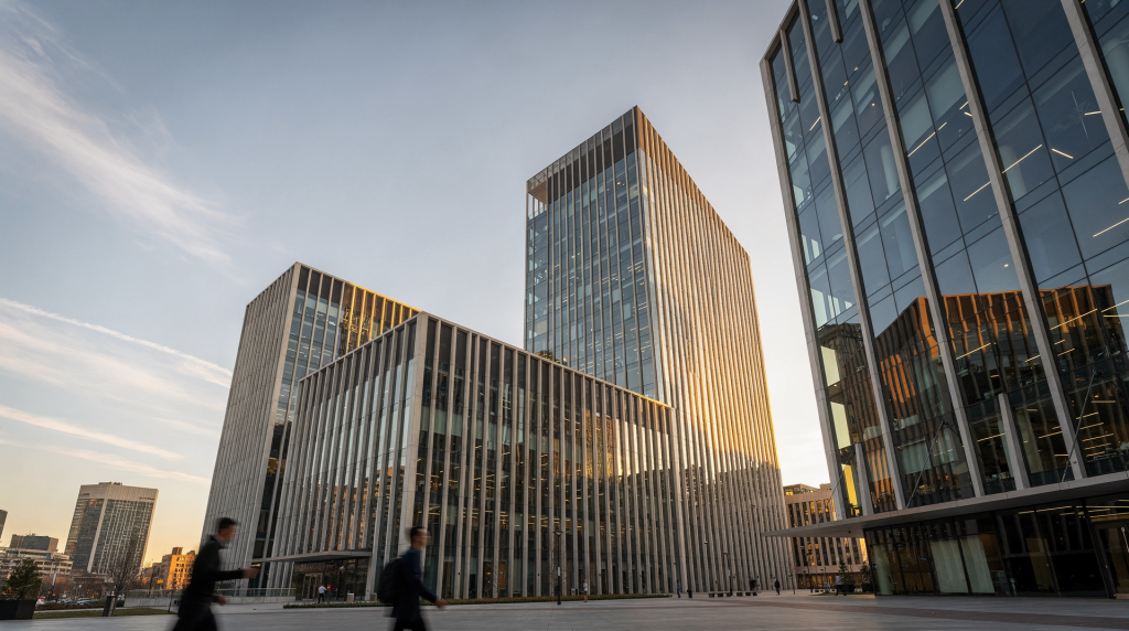
Architectural video works best when the camera respects the building’s geometry instead of fighting it. Strong lines, clear scale cues, and deliberate movement help a space feel larger, more organized, and easier to understand.
Why composition matters in architectural video
A good architectural shot does more than show a room. It explains how the space works, where the eye should go, and how the viewer should feel while moving through it. In property marketing, that usually means making layouts feel logical, bright, and spacious rather than busy or flat.
The three biggest tools are:
- Lines: they guide the viewer’s attention.
- Scale: it tells the viewer how big the space really is.
- Movement: it turns still geometry into a visual experience.
Used well, these elements make even a simple room feel more valuable and memorable.
1. Lines: the backbone of architectural composition
Architectural spaces are full of lines. Walls, floors, countertops, stair rails, windows, beams, and hallways all create structure in the frame. The job of the camera is to find those lines and make them work for the shot.
The main types of lines in architectural video
| Line type | What it does | Best use case |
|---|---|---|
| Horizontal lines | Create calm, stability, and width | Living rooms, wide exteriors, pool views |
| Vertical lines | Create strength, order, and height | Facades, stairwells, entryways |
| Diagonal lines | Add energy and depth | Hallways, angled ceilings, staircases |
| Converging lines | Pull the eye toward a focal point | Corridors, long sightlines, vanishing-point shots |
| Curved lines | Add softness and flow | Spiral stairs, arches, luxury interiors |
How to use leading lines
Leading lines are lines that point the viewer toward the subject. In architectural video, they are often the easiest way to control attention without needing extra movement.
Good examples include:
- Hallways that draw the eye into a room
- Floorboards that stretch toward a view
- Countertops that guide attention to a kitchen island
- Stair rails that direct the eye upward
- Window mullions that frame an exterior view
The rule is simple: if the line points somewhere, make sure that destination matters.
Common mistake: pretty lines with no purpose
Many shots look visually strong but say nothing. A diagonal ceiling line or a hallway with elegant symmetry only helps if it supports the story of the space. Ask one question before rolling: where should the viewer look first, and why?
2. Scale: showing size without saying it out loud
Scale is one of the hardest things to communicate on video. A still frame can hide room size easily, and a moving camera can make spaces feel larger or smaller depending on how it is used.
What gives viewers a sense of scale
Use objects and perspective cues that the brain already understands:
- Door frames
- Furniture proportions
- Ceiling height
- Window size
- Human movement
- Repeating architectural elements
A large island looks bigger when a person walks beside it. A vaulted ceiling feels taller when vertical lines are kept straight and the camera does not tilt up too aggressively. A long room feels longer when foreground, midground, and background are all visible at once.
Scale should feel truthful
The goal is not to exaggerate the space. It is to make the scale legible.
Avoid these mistakes:
- Overly wide lenses that distort edges
- Excessive tilting that makes ceilings feel unnatural
- Moving too close to a feature so everything else loses context
- Cropping out reference points that show real room size
A room should look impressive because it is well presented, not because the camera has hidden its proportions.
Simple rule for scale shots
If the space is large, include a foreground object to anchor the viewer.
If the space is compact, keep the frame open and clean so the viewer can read the layout quickly.
3. Movement: giving architecture rhythm
Movement is what turns architectural video from documentation into experience. But unlike lifestyle video, architectural movement should usually feel controlled, measured, and purposeful.
The best camera movements for architectural video
- Push-in: moves toward a feature and creates invitation
- Pull-back: reveals more of the room and expands context
- Lateral slide: shows width, layout, and parallax
- Reveal move: uses an object or wall to uncover part of the scene
- Orbit or arc: adds depth around a focal feature
- Walkthrough: mimics human movement through the property
What each movement communicates
| Movement | Best effect | Typical use |
|---|---|---|
| Push-in | Focus, intimacy, discovery | Kitchen islands, fireplaces, views |
| Pull-back | Context, scale, reveal | Small rooms, entry transitions |
| Lateral slide | Width, continuity, elegance | Great rooms, open plans, exteriors |
| Reveal | Curiosity, structure, pacing | Doorways, hallways, columns |
| Orbit | Depth, feature emphasis | Staircases, architectural focal points |
| Walkthrough | Real-world experience | Full property tours |
Match movement to the lines in the frame
Movement should feel like it belongs to the architecture.
- If the strongest lines run left to right, a lateral slide often feels natural.
- If lines converge toward a view, a slow push-in usually works better.
- If the space opens around a central feature, an orbit can emphasize symmetry and depth.
- If a doorway or column can hide and reveal part of the room, use that for a more cinematic transition.
When movement and geometry agree, the shot feels effortless.
4. Composition strategies that work in real properties
Rule of thirds still matters
Placing the main feature on a third often creates a more balanced frame than centering everything by default. That said, architectural video also makes strong use of symmetry, especially in facades, staircases, and front doors.
Use thirds when:
- You want the room to feel dynamic
- The subject is off-center in a natural way
- The frame includes both architecture and decor
Use symmetry when:
- The architecture is designed around a central axis
- You want calm, formal presentation
- You are filming entrances, hallways, or staircases
Keep verticals straight
This is non-negotiable in architectural work. If walls, door frames, and window edges lean unnaturally, the space immediately feels less polished.
Check for:
- Straight vertical lines
- Level horizons
- No accidental camera roll
- Minimal distortion from the lens
A slight composition adjustment often fixes more than post-production can.
Use foreground, middle ground, and background
Depth makes video feel more dimensional. A flat shot often looks smaller than the room really is.
Try building shots with:
- Foreground: doorway edge, chair, plant, railing
- Middle ground: main subject, furniture, island, sofa
- Background: window view, adjacent room, exterior line
This layering gives the viewer a clear route through the frame.
5. A practical workflow for composing architectural video
Before you record
- Walk the space slowly and identify the strongest lines.
- Decide what the room should communicate: size, luxury, openness, flow, or symmetry.
- Pick the best vantage point for that message.
- Check where natural light falls and how it affects surfaces.
- Decide whether the shot needs stillness, reveal, or motion.
While framing the shot
- Lock vertical lines first.
- Place the primary feature intentionally, not by accident.
- Remove visual clutter from the edges.
- Look for a foreground element if the frame feels too flat.
- Test the movement path before recording the full take.
During the move
- Start and end with strong compositions.
- Move slowly enough for the viewer to read the space.
- Avoid sudden speed changes.
- Keep the subject supported by the architectural lines.
- Stop only when the final frame feels complete.
6. Examples of composition choices by space type
| Space type | Best line strategy | Best movement | What to emphasize |
|---|---|---|---|
| Entryway | Symmetry and verticals | Slow push-in | Welcome, structure, first impression |
| Hallway | Converging lines | Forward walk or push | Depth and flow |
| Kitchen | Counters and cabinetry lines | Lateral slide | Function, width, finishes |
| Living room | Horizontal balance and depth layers | Slow arc or slide | Spaciousness, comfort |
| Staircase | Vertical and diagonal lines | Upward reveal or orbit | Drama, height, movement |
| Exterior facade | Strong symmetry | Static or subtle move | Scale, design, curb appeal |
7. Typical mistakes that weaken architectural video
- Shooting without a clear focal point
- Overusing movement just because it looks cinematic
- Ignoring vertical alignment
- Using a lens that exaggerates distortion
- Letting lines pull attention away from the subject
- Moving too fast for the viewer to understand the space
- Framing rooms so tightly that scale disappears
- Leaving clutter near frame edges
Most of these problems are not gear problems. They are planning problems.
8. A simple checklist before you hit record
- Are the verticals straight?
- Do the lines guide the eye toward the intended subject?
- Does the frame show enough context to understand scale?
- Is the movement natural for the architecture?
- Is the shot starting and ending on strong compositions?
- Is there a clear reason for this camera position?
- Does the frame feel clean at the edges?
If the answer to any of these is no, adjust before recording.
FAQ
What is the most important compositional rule in architectural video?
Keep the geometry clean and intentional. Straight verticals, readable lines, and controlled movement matter more than complex camera tricks.
Should architectural video always use the rule of thirds?
No. The rule of thirds works well, but symmetry is often stronger in architecture, especially for entrances, facades, and centered interior features.
How do I make a room look bigger on video?
Show depth, use a clear foreground-to-background structure, keep lines straight, and avoid moves that compress the space.
What camera movement works best for real estate interiors?
A slow lateral slide or a gentle push-in usually works best because both reveal layout without making the space feel chaotic.
How do I know if my composition is too busy?
If the viewer’s eye jumps between too many elements, the frame lacks a clear subject. Remove clutter, simplify the edges, and strengthen the leading lines.
Conclusion
Architectural video composition is not about making a building look dramatic at any cost. It is about using lines to guide attention, scale to clarify size, and movement to reveal the space with control. When those three elements work together, the video feels more premium, more truthful, and far easier for buyers or clients to understand.
The best architectural shots usually come from a simple habit: look at the geometry first, then decide how the camera should behave.